Lightbox Popup
A lightbox popup is a centered overlay that appears on top of the page content, dimming the background to focus visitor attention on the campaign. It is the most attention-grabbing of the three campaign types in ConvertForce.
Common uses include promotional offers, discount codes, important announcements, gated content, seasonal sale callouts, and high-value CTAs that require immediate attention.
Creating a Lightbox Popup
- Navigate to ConvertForce → New Campaign.
- Enter a campaign name.
- Under Conversion Type, select Lightbox Popup.
- Start designing from a blank canvas.
The campaign opens in the WordPress block editor, where the popup can be designed using standard Gutenberg blocks — paragraph, button, heading, image, and more. Each element inside the popup can be selected and customized individually using the standard block editor controls in the Block tab.
Note: Templates for lightbox popups are planned for a future update. Currently, popups are built from a blank canvas.
Layout Settings
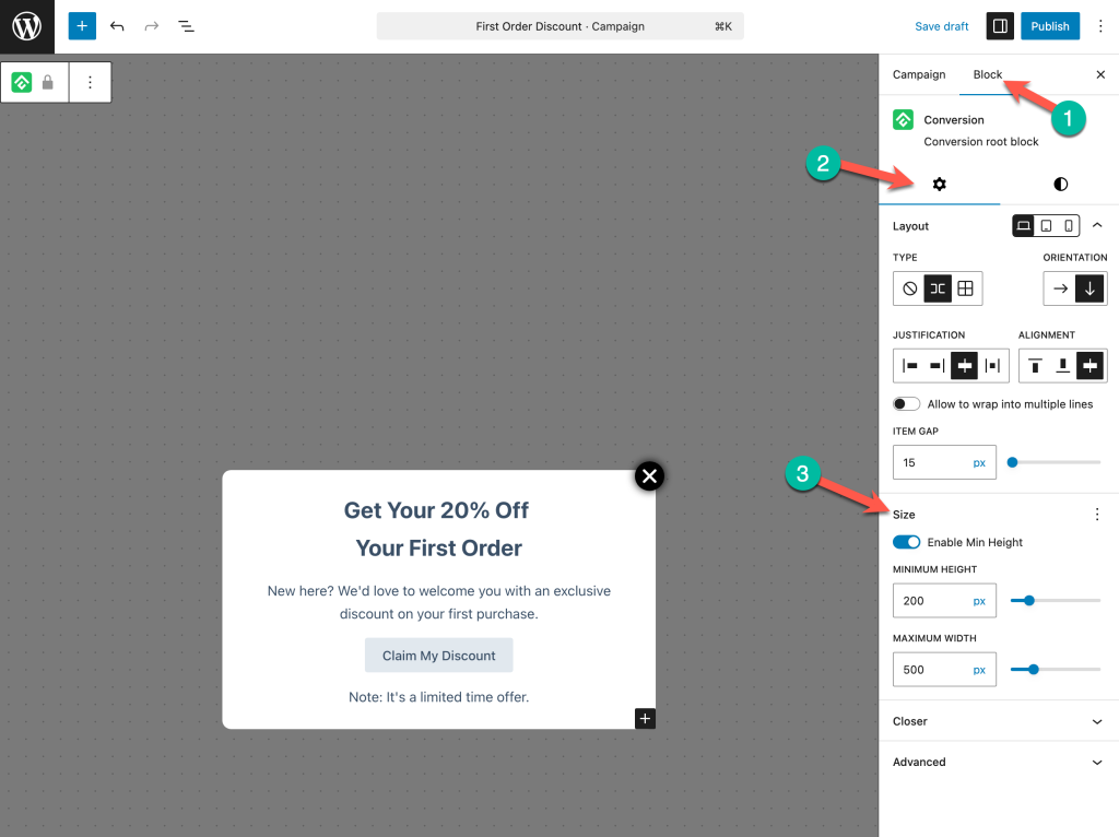
Layout settings control how content is arranged inside the popup. These are found in the Settings tab of the Block tab when the root block (ConvertForce) is selected, under the Layout section.
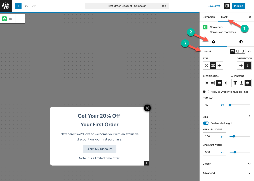
Orientation
Sets the content direction — horizontal (row) or vertical (column). Popups typically use vertical orientation to stack a heading, message, and CTA button.
Justification and Alignment
Justification handles horizontal spacing (left, center, right, space-between). Alignment handles vertical alignment of items (top, center, bottom, stretch).
Allow to Wrap into Multiple Lines
When enabled, content wraps to the next line if it exceeds the popup’s width. Useful for responsive behavior on smaller screens.
Item Gap
Sets the spacing between items inside the popup in pixels.
Size Settings
Size settings are found in the Setting tab of the Block tab when the root block (ConvertForce) is selected.
Minimum Height
Toggle Enable Min Height to set a minimum height for the popup in pixels. The default is 200px.
Max Width
Sets the maximum width of the popup in pixels. The default is 500px. Increasing this value creates a wider popup; decreasing it creates a more compact one.
Style Settings
Style settings control the visual appearance of the popup. These are found in the Block tab under the Styles panel (the half-circle icon) when the root block (ConvertForce) is selected.
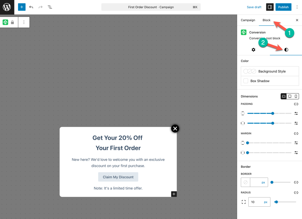
Color
- Background Style — Set a solid color, gradient, or image as the popup’s background.
- Box Shadow — Add a shadow around the popup for depth and separation from the backdrop.
Dimensions
- Padding — Controls the inner spacing between the popup’s content and its edges. Adjust individual sides or link them to apply uniform padding.
- Margin — Controls the outer spacing around the popup.
Dimensions can also be set per device (desktop, tablet, mobile) using the responsive breakpoint icons.
Border
- Border — Set the border color, width, and style around the popup.
- Radius — Controls the corner rounding of the popup in pixels. A value of 0 keeps the corners sharp.
Close Button
The close button (referred to as Closer in the settings) allows visitors to dismiss the popup. Close button settings are found in the Block tab under the Closer section.
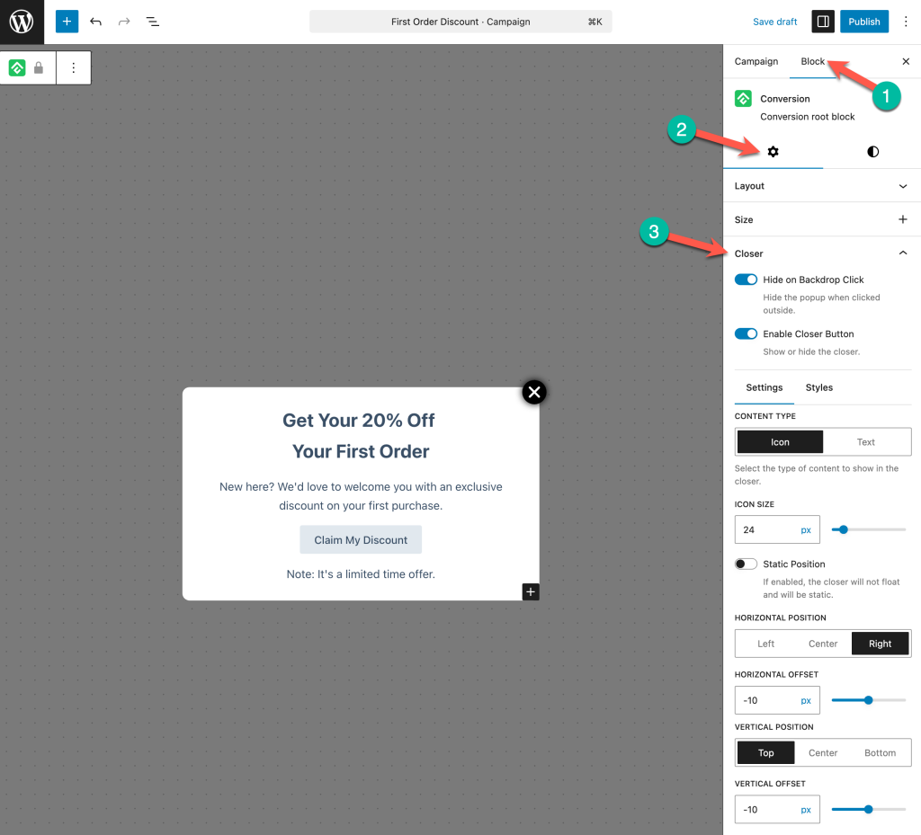
Enable Closer Button
A toggle to show or hide the close button. When disabled, visitors can only close the popup by clicking the backdrop (if enabled).
Hide on Backdrop Click
When enabled, visitors can close the popup by clicking anywhere outside it (on the dimmed backdrop). This is enabled by default. Disabling it requires visitors to use the close button to dismiss the popup.
Content Type
Choose between Icon (a close/X icon) or Text (custom text like “Dismiss” or “Close”).
Icon Size
Sets the size of the close icon in pixels.
Static Position
When enabled, the close button sits within the popup’s content flow rather than floating over it.
Close Button Position
Controls where the close button appears:
- Horizontal Position — Left, Center, or Right.
- Horizontal Offset — Fine-tune the horizontal placement in pixels.
- Vertical Position — Top, Center, or Bottom.
- Vertical Offset — Fine-tune the vertical placement in pixels.
Position Settings
Position settings control where the popup appears on the screen. These settings are found in the Campaign tab under the Position section.
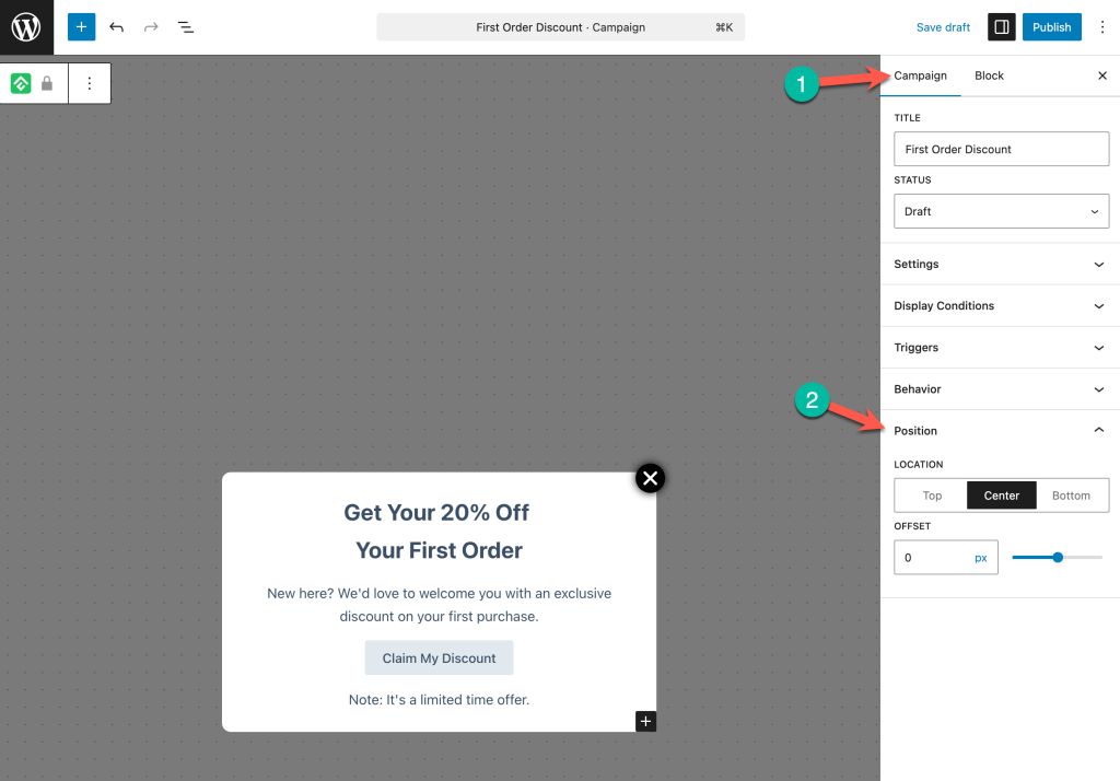
Location
Determines the vertical placement of the popup on the screen: Top, Center, or Bottom. Center is the default and most common choice for lightbox popups.
Offset
Fine-tunes the vertical position with a pixel value. Useful for nudging the popup slightly up or down from the selected location.
Designing an Effective Lightbox Popup
A few principles for getting the most out of lightbox popups:
Lead with a strong headline. The headline is the first thing visitors see. Make it clear and benefit-driven — “Get 20% Off Your First Order” works better than “Special Offer Inside.”
Keep the content focused. A popup should communicate one message and drive one action. Avoid cramming multiple offers or too much text into a single popup.
Use a prominent CTA button. The button should stand out visually and use action-oriented text like “Claim My Discount,” “Shop the Sale,” or “Get Started.”
Respect the visitor’s experience. Popups demand attention — use them for high-value moments, not every page visit. Combine with display conditions and behavior settings to control how often and where the popup appears.
Frequently Asked Questions
Can visitors close the popup by clicking outside it?
Yes. The Hide on Backdrop Click option is enabled by default in the Closer settings. Visitors can click anywhere outside the popup to dismiss it.
Can I position the popup at the top or bottom of the screen instead of the center?
Yes. Change the Location setting under Position to Top or Bottom.
What is the default popup size?
The default Minimum Height is 200px and the default Max Width is 500px. Both can be adjusted in the Size settings.
Can I hide the close button entirely?
Yes. Toggle off Enable Closer Button in the Closer settings. If Hide on Backdrop Click is also disabled, visitors will not be able to dismiss the popup until they navigate away — use this combination carefully.
Does the popup have an entrance animation?
No. The popup appears immediately when triggered. Entrance animations are not currently available.