Slide-In
A slide-in is a compact panel that slides in from the corner of the screen. It sits in the visitor’s peripheral vision without blocking page content, making it a balanced middle ground between notification bars and lightbox popups.
Common uses include promotional nudges, discount code announcements, new content highlights, product recommendations, static social proof (testimonials, star ratings, trust badges), and subtle CTAs linking to offers or landing pages.
Creating a Slide-In
- Navigate to ConvertForce → New Campaign.
- Enter a campaign name.
- Under Conversion Type, select Slide-In.
- Start designing from a blank canvas.
The campaign opens in the WordPress block editor, where the slide-in can be designed using standard Gutenberg blocks — paragraph, button, heading, image, and more. Each element inside the slide-in can be selected and customized individually using the standard block editor controls in the Block tab.
Note: Templates for slide-ins are planned for a future update. Currently, slide-ins are built from a blank canvas.
Layout Settings
Layout settings control how content is arranged inside the slide-in. These are found in the Settings tab of the Block tab when the root block (ConvertForce) is selected, under the Layout section.
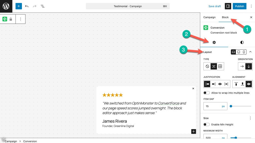
Orientation
Sets the content direction — horizontal (row) or vertical (column). Slide-ins typically use vertical orientation to stack content in a compact panel.
Justification and Alignment
Justification handles horizontal spacing (left, center, right, space-between). Alignment handles vertical alignment of items (top, center, bottom, stretch).
Allow to Wrap into Multiple Lines
When enabled, content wraps to the next line if it exceeds the slide-in’s width. Useful for responsive behavior on smaller screens.
Item Gap
Sets the spacing between items inside the slide-in in pixels.
Size Settings
Size settings are found in the Settings tab of the Block tab when the root block (ConvertForce) is selected.
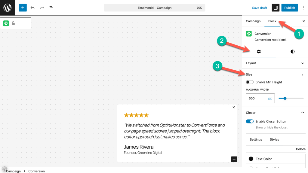
Minimum Height
Toggle Enable Min Height to set a minimum height for the slide-in in pixels.
Max Width
Sets the maximum width of the slide-in in pixels. Keeping this value modest (around 300-400px) maintains the compact feel that makes slide-ins non-intrusive.
Style Settings
Style settings control the visual appearance of the slide-in. These are found in the Block tab under the Styles panel (the half-circle icon) when the root block (ConvertForce) is selected.
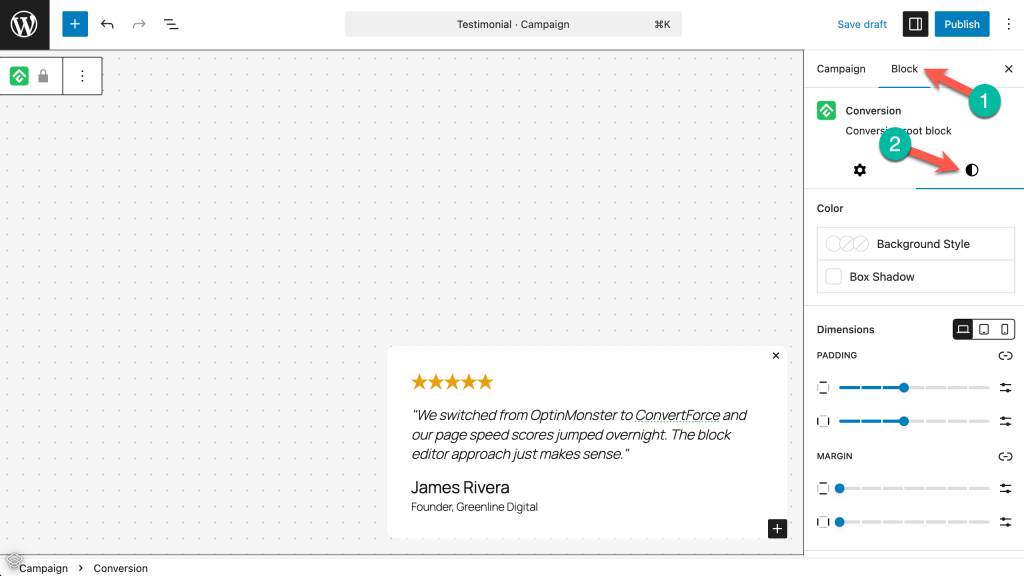
Color
- Background Style — Set a solid color, gradient, or image as the slide-in’s background.
- Box Shadow — Add a shadow around the slide-in for depth and visual separation from the page.
Dimensions
- Padding — Controls the inner spacing between the slide-in’s content and its edges. Adjust individual sides or link them to apply uniform padding.
- Margin — Controls the outer spacing around the slide-in.
Dimensions can also be set per device (desktop, tablet, mobile) using the responsive breakpoint icons.
Border
- Border — Set the border color, width, and style around the slide-in.
- Radius — Controls the corner rounding of the slide-in in pixels. A value of 0 keeps the corners sharp. Adding a slight radius (8-12px) gives slide-ins a softer, card-like appearance.
Close Button
The close button (referred to as Closer in the settings) allows visitors to dismiss the slide-in. Close button settings are found in the Block tab under the Closer section.
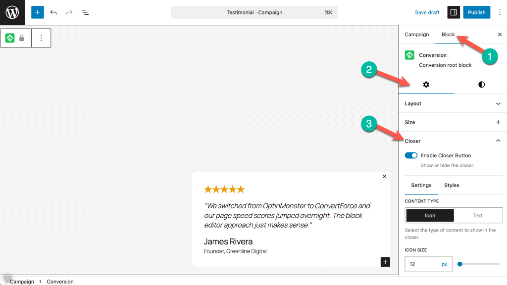
Enable Closer Button
A toggle to show or hide the close button.
Hide on Backdrop Click
When enabled, visitors can close the slide-in by clicking anywhere outside it. This is enabled by default.
Content Type
Choose between Icon (a close/X icon) or Text (custom text like “Dismiss” or “Close”).
Icon Size
Sets the size of the close icon in pixels.
Static Position
When enabled, the close button sits within the slide-in’s content flow rather than floating over it.
Close Button Position
Controls where the close button appears:
- Horizontal Position — Left, Center, or Right.
- Horizontal Offset — Fine-tune the horizontal placement in pixels.
- Vertical Position — Top, Center, or Bottom.
- Vertical Offset — Fine-tune the vertical placement in pixels.
Position Settings
Position settings control where the slide-in appears on the screen. These settings are found in the Campaign tab under the Position section.
Position is where slide-ins differ most from the other campaign types. The combination of Horizontal Position and Vertical Position determines which corner of the screen the slide-in appears in.
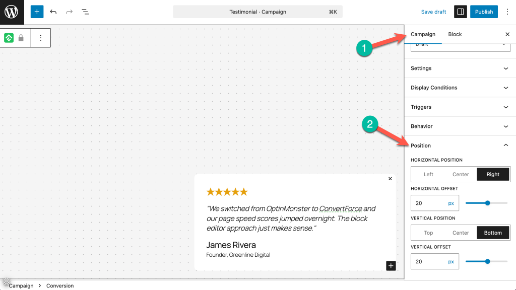
Horizontal Position
Controls which side of the screen the slide-in appears on: Left, Center, or Right. Right is the most common choice, placing the slide-in in the bottom-right corner when combined with a Bottom vertical position.
Vertical Position
Determines whether the slide-in appears at the Top, Center, or Bottom of the screen. Bottom is the most common choice for slide-ins.
Common Position Combinations
- Right + Bottom — Bottom-right corner. The most widely used slide-in position.
- Left + Bottom — Bottom-left corner. Good for sites with right-to-left layouts or to avoid overlapping other bottom-right elements like chat widgets.
- Right + Top — Top-right corner. Less common but useful for urgent notices.
Designing an Effective Slide-In
A few principles for getting the most out of slide-ins:
Keep it compact. Slide-ins work best when they’re small and focused. A short headline, one or two lines of text, and a single CTA button is the ideal structure.
Don’t compete with the main content. The strength of a slide-in is that it nudges without interrupting. Avoid making it too large or visually aggressive.
Use for secondary actions. Slide-ins are ideal for prompts that support the visitor’s current activity — related content, a gentle promotional nudge, or a trust-building testimonial. Save high-priority actions for lightbox popups.
Position thoughtfully. If the site already has a chat widget or cookie notice in the bottom-right corner, place the slide-in in the bottom-left to avoid overlap.
Frequently Asked Questions
Which corner does the slide-in appear in by default?
The default position depends on the Horizontal Position and Vertical Position settings. The most common configuration is bottom-right (Right + Bottom).
Can I place the slide-in on the left side of the screen?
Yes. Set the Horizontal Position to Left in the Position settings.
What is the difference between a slide-in and a lightbox popup?
A lightbox popup appears centered on the screen and overlays the page content, demanding full attention. A slide-in appears in a corner of the screen without blocking content, making it less intrusive.
Can I show a customer testimonial in a slide-in?
Yes. Static social proof content like testimonials, star ratings, and trust badges can be built directly in the block editor and displayed in a slide-in. ConvertForce does not support dynamic or live social proof (such as real-time purchase notifications).
Does the slide-in have an entrance animation?
No. The slide-in appears immediately when triggered. Entrance animations are not currently available.
Can I use a slide-in and a notification bar on the same page?
Yes. Multiple campaigns of different types can run simultaneously, each with its own display conditions and triggers.