Device Conditions
Device conditions target a campaign based on the hardware a visitor is using. This category contains six conditions and covers the most common targeting request in ConvertForce: running a campaign on mobile only, or on desktop only.
Device conditions are found in the Campaign tab of the campaign editor sidebar, under Advanced Targeting. Open the Condition dropdown and select Device. Advanced Targeting requires ConvertForce Pro.
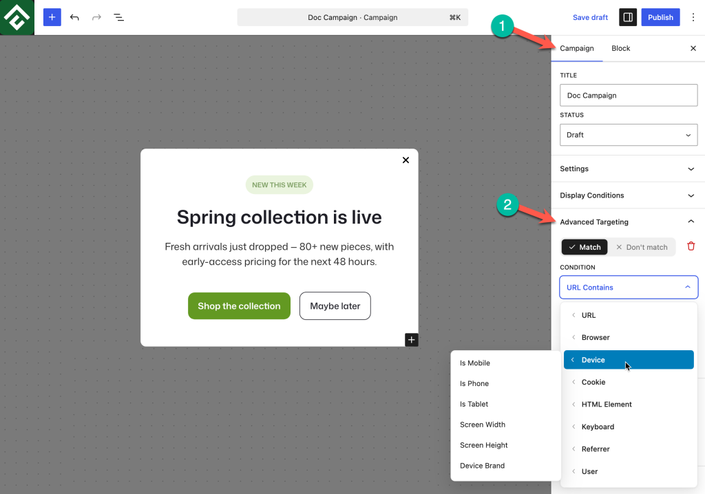
Available Conditions
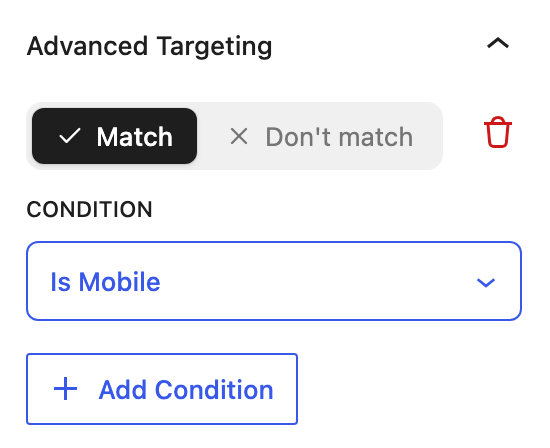
The three device type conditions need no configuration. Selecting one is the whole rule, and no input fields appear beneath it. The two screen size conditions ask for a range instead.
Is Mobile
Matches mobile devices as a group, which covers both phones and tablets. No value is needed. This is the broadest of the three device type conditions and the right choice when the distinction between a phone and a tablet does not matter.
Use case: A compact bar written for touch screens, shown on every handheld device without maintaining separate phone and tablet campaigns.
Is Phone
Matches phones only, excluding tablets. No value is needed. Use it when a campaign is written for the smallest screens and would look sparse on a tablet.
Use case: A click-to-call bar, which makes sense on a phone and does not on a tablet.
Is Tablet
Matches tablets only, excluding phones and desktops. No value is needed.
Use case: A two-column lightbox that has room to work on a tablet but would be cramped on a phone, running alongside a separate desktop version.
Screen Width
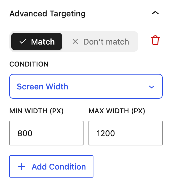
Matches on the width of the visitor’s physical display, measured in pixels. Selecting it reveals two fields, Min Width (px) and Max Width (px), so the condition describes a range rather than a single number.
Use case: Separating small phones from large ones, which the Is Phone condition treats as a single group.
Screen Height
Matches on the height of the visitor’s physical display in pixels, using the same pair of fields: Min Height (px) and Max Height (px).
Use case: Excluding short displays from a campaign that needs vertical room, with a shorter bar campaign covering them instead.
Device Brand
Matches on the manufacturer of the visitor’s device.
Use case: Promoting the correct app store link, so visitors on one brand of device are not sent to a download page that does not apply to them.
Using Minimum and Maximum Values
Screen Width and Screen Height both take a minimum and a maximum, which makes a single condition capable of expressing three different rules:
- Both fields filled — Targets a band. A campaign restricted to a specific size class of device sits between two numbers.
- Minimum only — Targets everything at or above that size, with no upper limit.
- Maximum only — Targets everything at or below that size, with no lower limit.
This is worth noting because it removes the need to stack two conditions. One Screen Width condition with both fields filled does the work that would otherwise require a separate greater-than and less-than rule.
Screen dimensions vary widely between devices, and a value that looks correct in a desktop browser will not always match what a phone reports. Test any size-based rule on a real device before relying on it, rather than choosing numbers from a breakpoint chart.
Targeting Desktop Visitors
There is no Is Desktop condition, because desktop is what remains once mobile devices are excluded. To run a campaign on desktop only, set Don’t match → Is Mobile.
This is the standard pattern for desktop-only campaigns and covers phones and tablets in one rule. Using Don’t match → Is Phone instead would leave tablets included, which is rarely the intention.
Choosing Between Device Type and Screen Size
Is Mobile, Is Phone, and Is Tablet identify a class of device and are the more readable and more maintainable choice for almost all campaigns. They also need no numbers, so they cannot drift out of date as new devices are released.
Screen Width and Screen Height are the specialist option, for rules a device category cannot express. Reach for them only when a campaign genuinely needs to distinguish between two devices of the same type.
When the goal is a layout decision rather than a hardware decision, the Browser category’s Browser Width and Browser Height conditions are usually more appropriate. Screen size describes the display the device has. Browser size describes the space the campaign will actually occupy, which changes when a visitor resizes their window.
Common Use Cases
Mobile-only campaign. Set Match → Is Mobile.
Desktop-only campaign. Set Don’t match → Is Mobile.
Phones only, tablets excluded. Set Match → Is Phone.
Mobile checkout reminder. Combine Match → Is Mobile with Match → URL Contains using a value of /checkout, so the reminder reaches only mobile shoppers mid-purchase.
Large screens only. Set Match → Screen Width and fill in the minimum field only, leaving the maximum empty so there is no upper limit.
App download prompt for one platform. Combine Match → Is Phone with Match → Device Brand so the link matches the device in the visitor’s hand.
Frequently Asked Questions
Does Is Mobile include tablets?
Yes. Is Mobile covers phones and tablets together. Use Is Phone or Is Tablet when the two need to be treated differently.
How is a desktop-only campaign created?
Set Don’t match → Is Mobile. There is no separate desktop condition because desktop is everything that is not a mobile device.
Can Is Phone and Is Tablet be combined to reach both?
No. Stacked conditions must all be true, and a device cannot be a phone and a tablet at the same time, so the campaign would never appear. Use Is Mobile to reach both.
Do both the minimum and maximum fields have to be filled in?
No. Fill in both to target a range, or fill in one to leave that end of the range open.
Is device targeting available in the free version?
No. Device conditions are part of Advanced Targeting and require ConvertForce Pro. The free version’s display conditions target by page and post rather than by device.
Do campaigns still look correct on mobile without device conditions?
Yes. Campaigns are responsive by default and adapt to any screen. Device conditions control whether a campaign runs on a device, not how it is styled once it does.